IDS brand book

A clear brand book contributes to a visible and recognizable IDS. Within this brand book there are several characteristics that determine the visual identity. This manual shows the building blocks that can be used to create resources.

Questions?

This brandbook is developed by ZUID Creatives. Any questions about the brandbook? Please contact us via info@zuid.com or call 013-545 03 23.
Logo

Logo with pay-off in green, on white or light background.

Logo with pay-off in white, on dark background (diapositive).

Logo with pay-off in green, on light background.

Margins

Make sure there is enough space around the logo. Never put text too close to the logo. And make sure the space is equal on al sides.

Pay-off version usage

Don’t use the pay-off version too small, in order to prevent the pay-of becomes hard to read. Be aware of the the logo size: when the pay-off gets unreadable, use the version without pay-off.

Typography

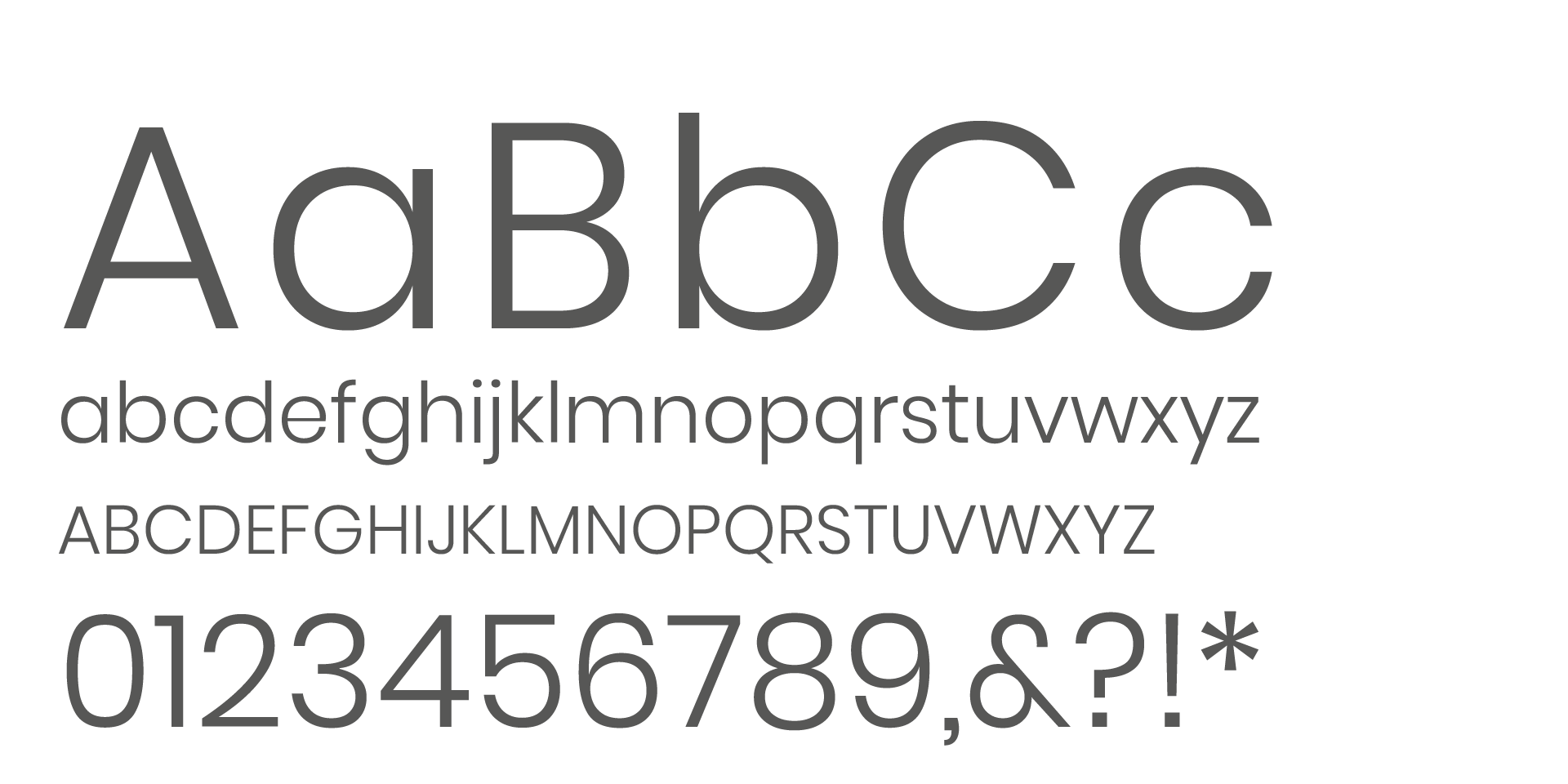
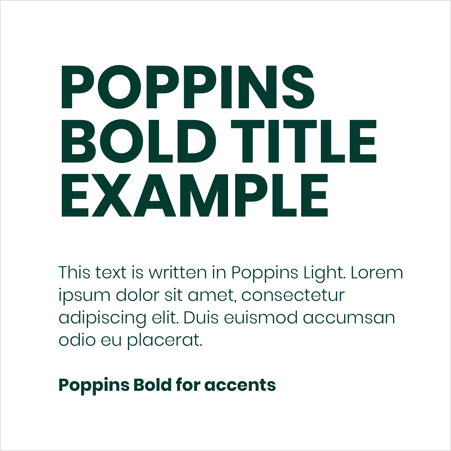
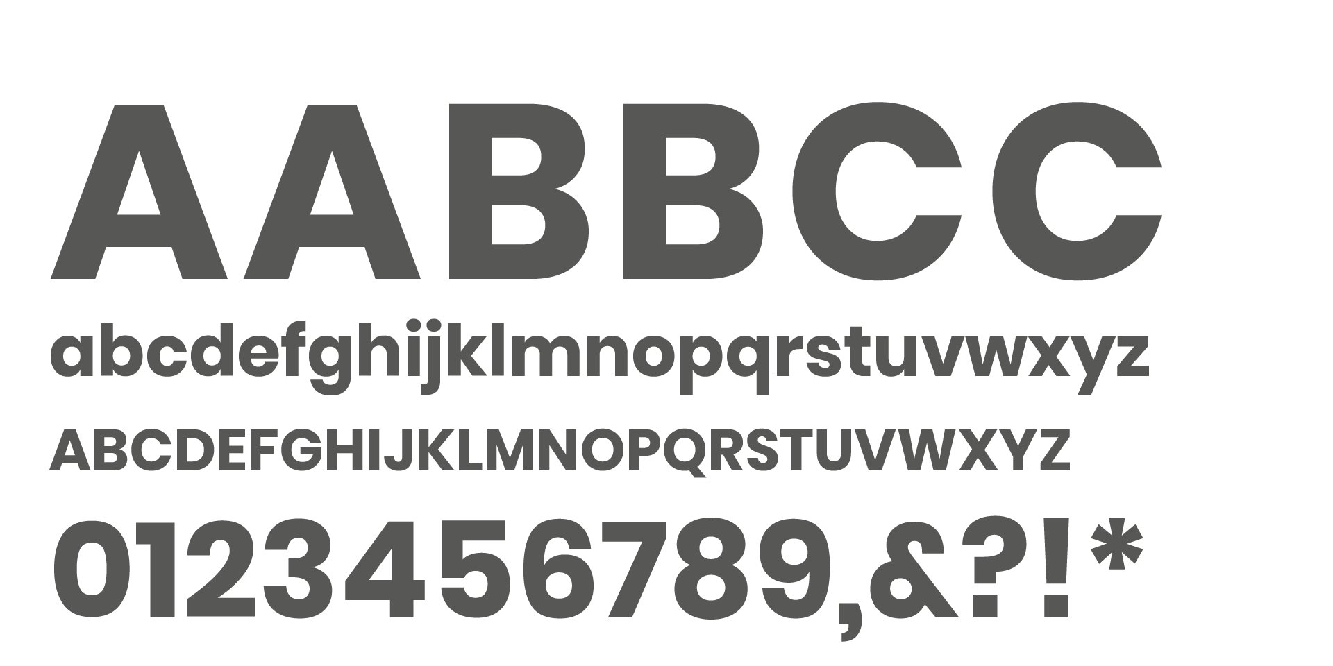
Poppins Bold

For use in main titles and to accent texts.

Line height

Titels = Font-size x 0.9
Body = Font-size x 1.3

Poppins Light

For use in long reads (bodycopy) and basic texts.

Line height

Body = Font size x 1.3

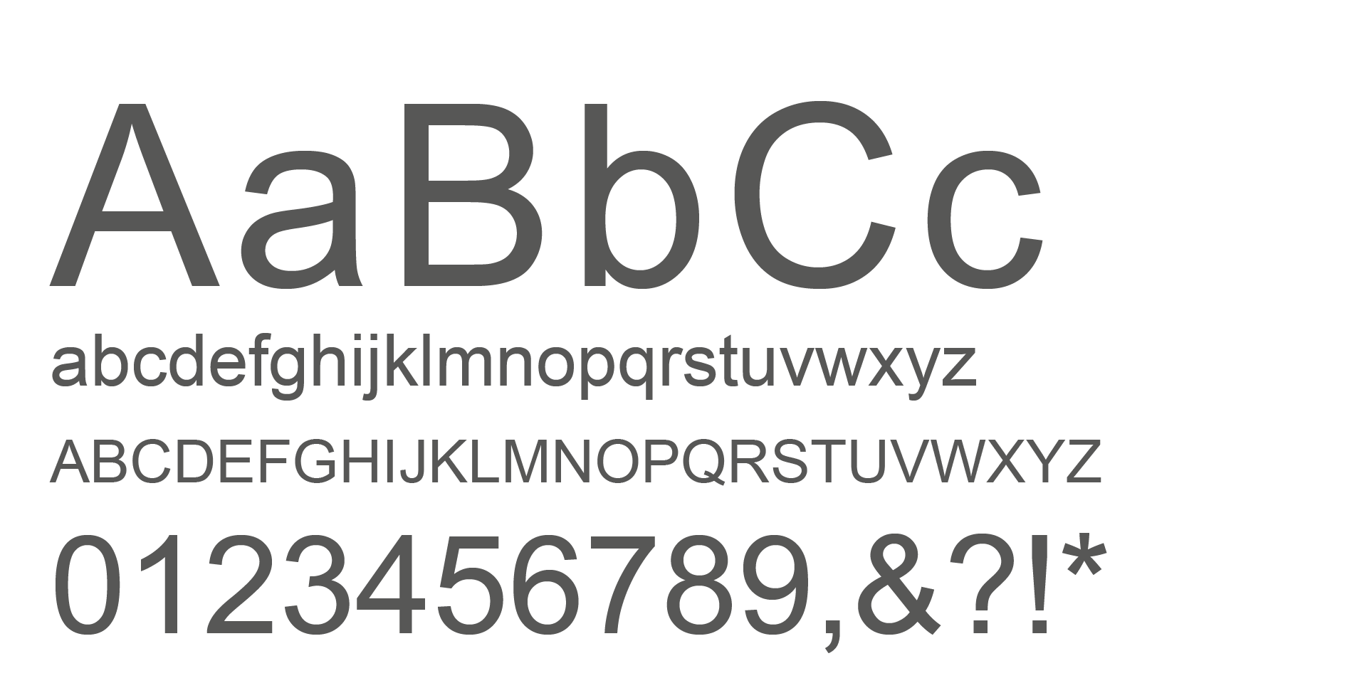
Arial Bold / Regular

Can be used as an alternative for the Poppins Bold / Light, in correspondence where standard fonts must be used.

Colors

Primary Yellow

The characteristic main color for IDS.

HEX: #ffcc00
RGB: R 255 / G 204 / B 0

CMYK: C 0 / M 20 / Y 100 / K 0

Primary Green

Main dark green color. For general use and as full surface backgrounds.

HEX: #043b30
RGB: R 4 / G 59 / B 48

CMYK: C 70 / M 0 / Y 50 / K 82

Warm grey

Color for adittional use.

HEX: #f0f0ec
RGB: R 240 / G 240 / B 236

CMYK: C 0 / M 0 / Y 3 / K 8

Layout

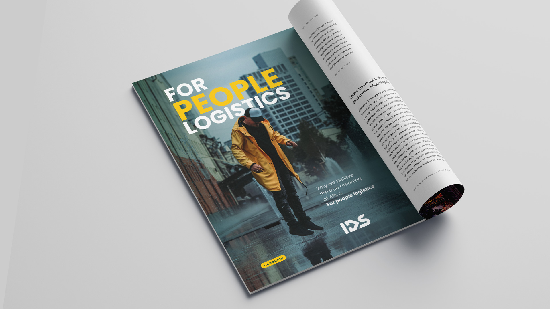
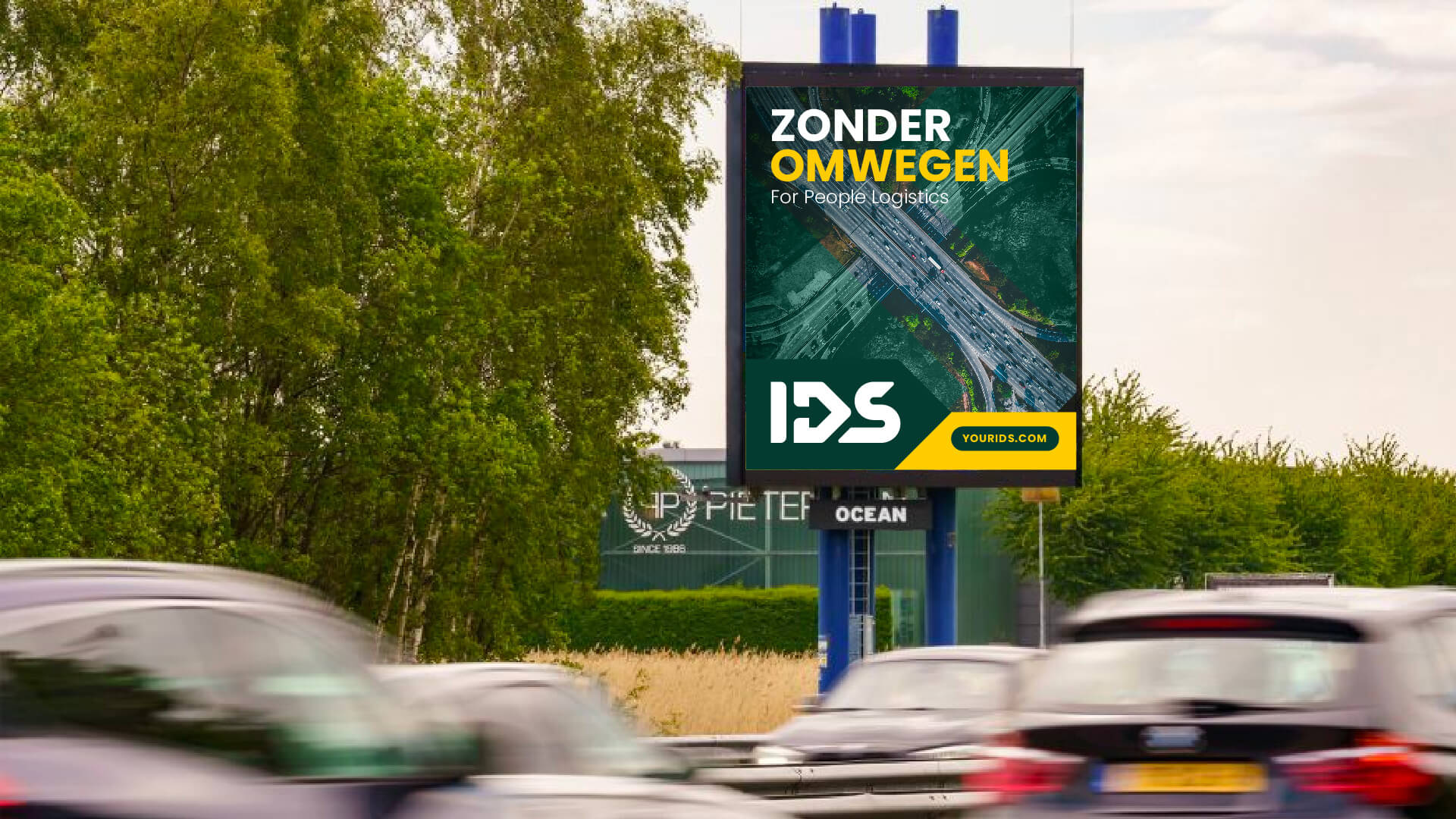
Examples of several layouts